Kitchen Cabinet Color Combinations: A Comprehensive Guide to Stunning Design
I stood in a kitchen where the upper cabinets were cream and the lower cabinets were sage green and the line between them was the countertop and the room felt like a place where the division had been given more thought than the individual choices. Two-tone kitchen cabinet color combinations work when the contrast is doing the organizing.
Why Kitchen Cabinet Colors Matter More Than You Think
Your kitchen cabinets are the silent storytellers of your home’s personality. They’re not just storage spaces – they’re design statements that can make or break your entire kitchen aesthetic.
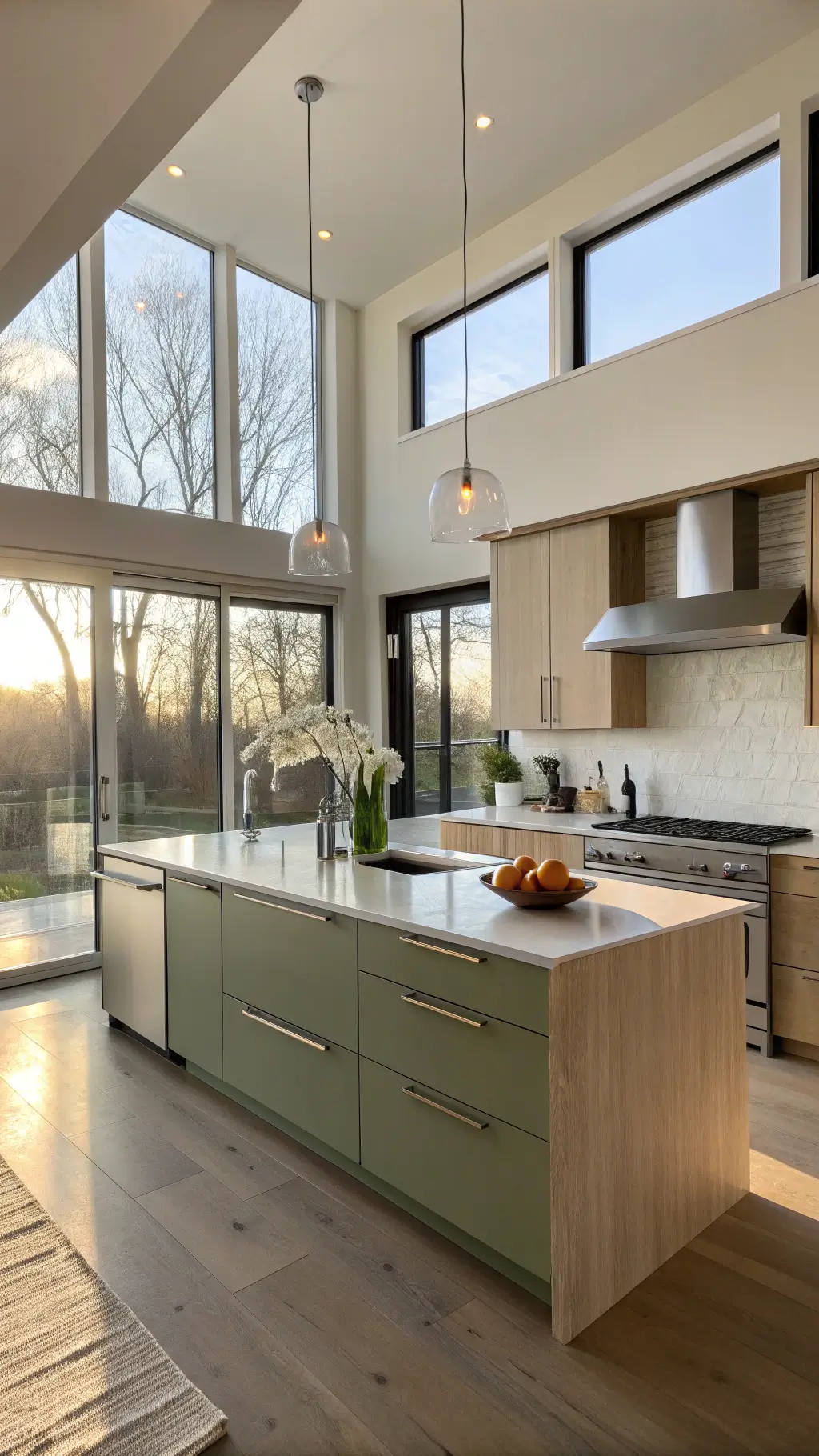
Color Palette Breakdown: Design Styles Decoded
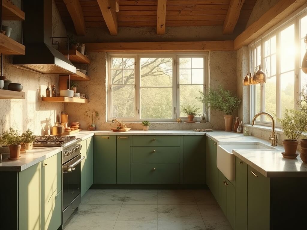
1. Modern Minimalist Magic
– Color Combo: Cool Green + Stainless Steel + Beige
– Vibe: Sleek, sophisticated, contemporary
– Perfect for: Professionals who love clean lines and understated elegance
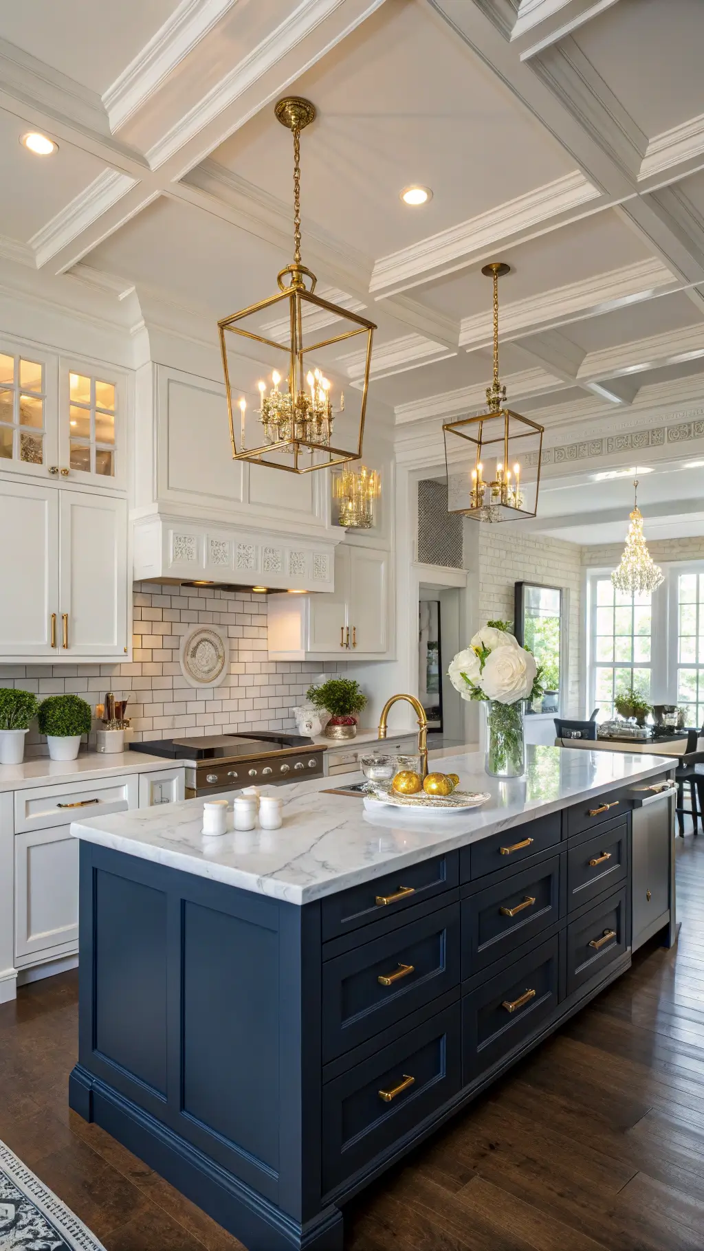
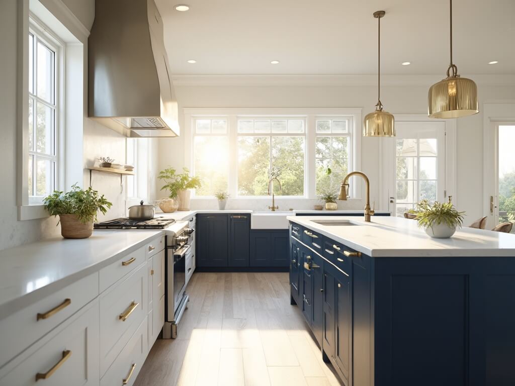
2. Classic Elegance
– Color Combo: Blue + White
– Vibe: Timeless, crisp, never goes out of style
– Ideal for: Traditional homes with a touch of sophistication

3. Coastal Breeze
– Color Combo: Light Blue + Sandy Whites
– Vibe: Relaxed, airy, reminiscent of beachside retreats
– Great for: Those dreaming of permanent vacation mode

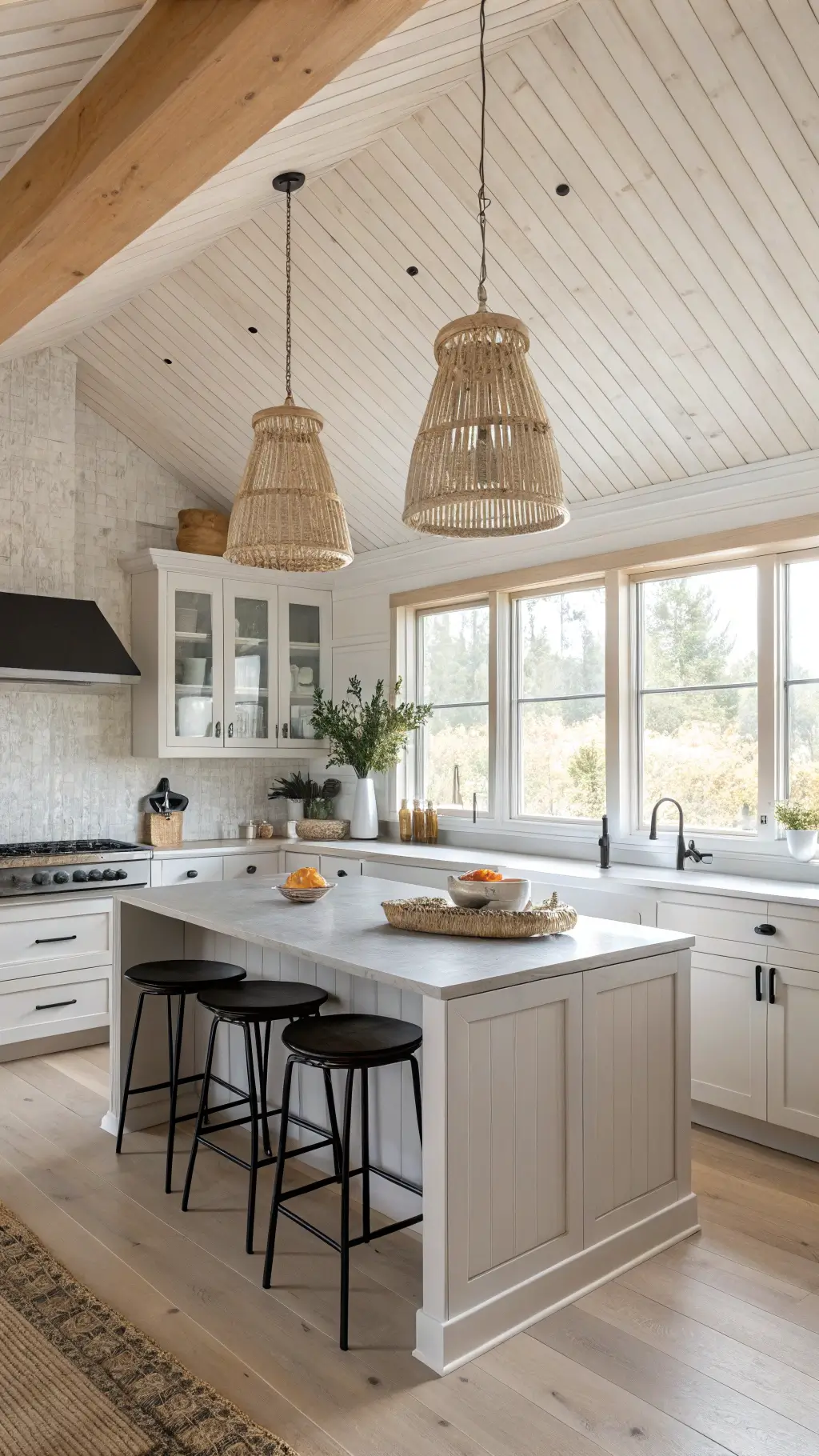
4. Farmhouse Charm
– Color Combo: Warm Whites + Distressed Wood
– Vibe: Cozy, rustic, welcoming
– Perfect for: Anyone craving that Instagram-worthy kitchen aesthetic
Pro Tips for Nailing Your Cabinet Color Strategy
Color Selection Secrets
Bold Moves:
– Don’t be afraid to mix unexpected colors
– Use the 60-30-10 color rule (60% dominant color, 30% secondary, 10% accent)
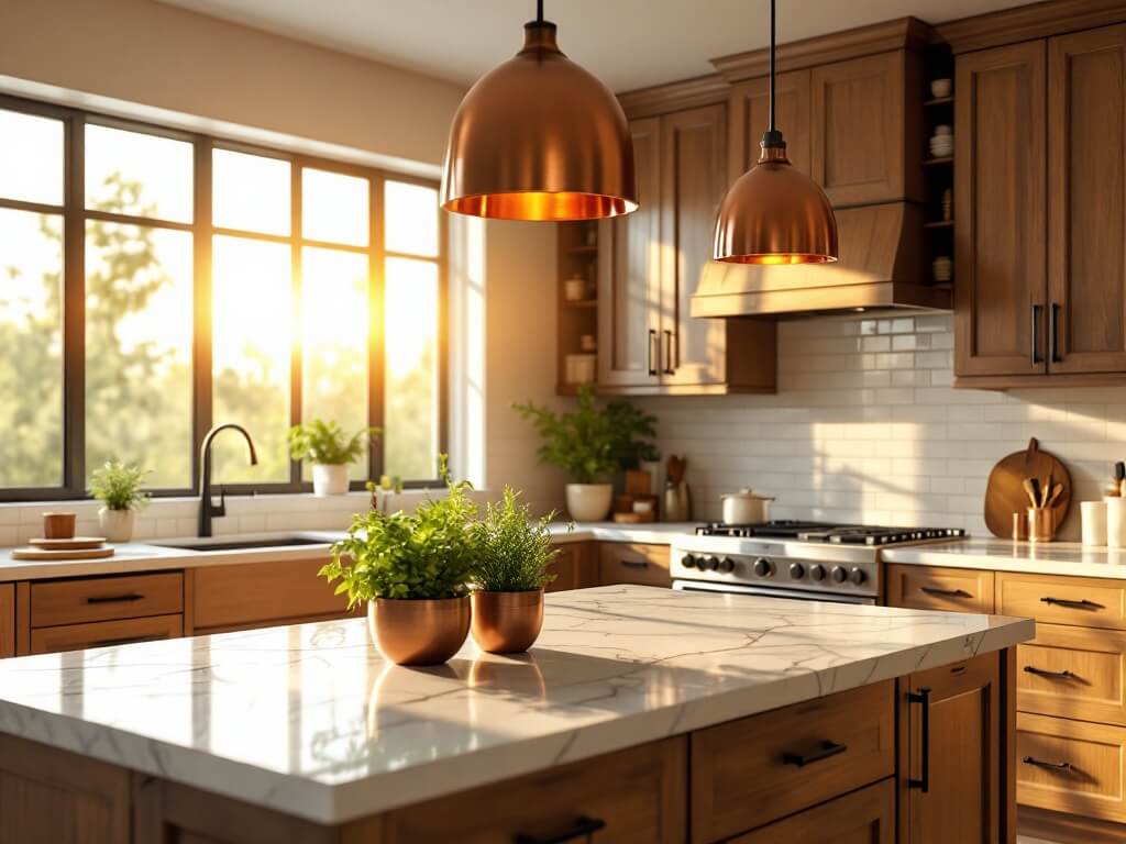
– Consider your kitchen’s natural lighting
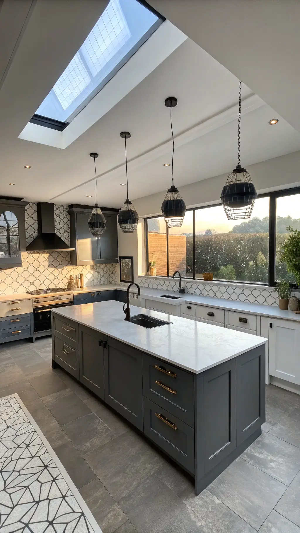
Practical Considerations
Must-Have Elements:
– Complementary countertop colors
– Hardware that enhances your color scheme
– Consideration of overall home design
Budget-Friendly Color Transformation Tips
Quick Wins:
– Paint existing cabinets instead of replacing
– Use high-quality, durable paint
– Invest in good primer
– Consider DIY for massive savings
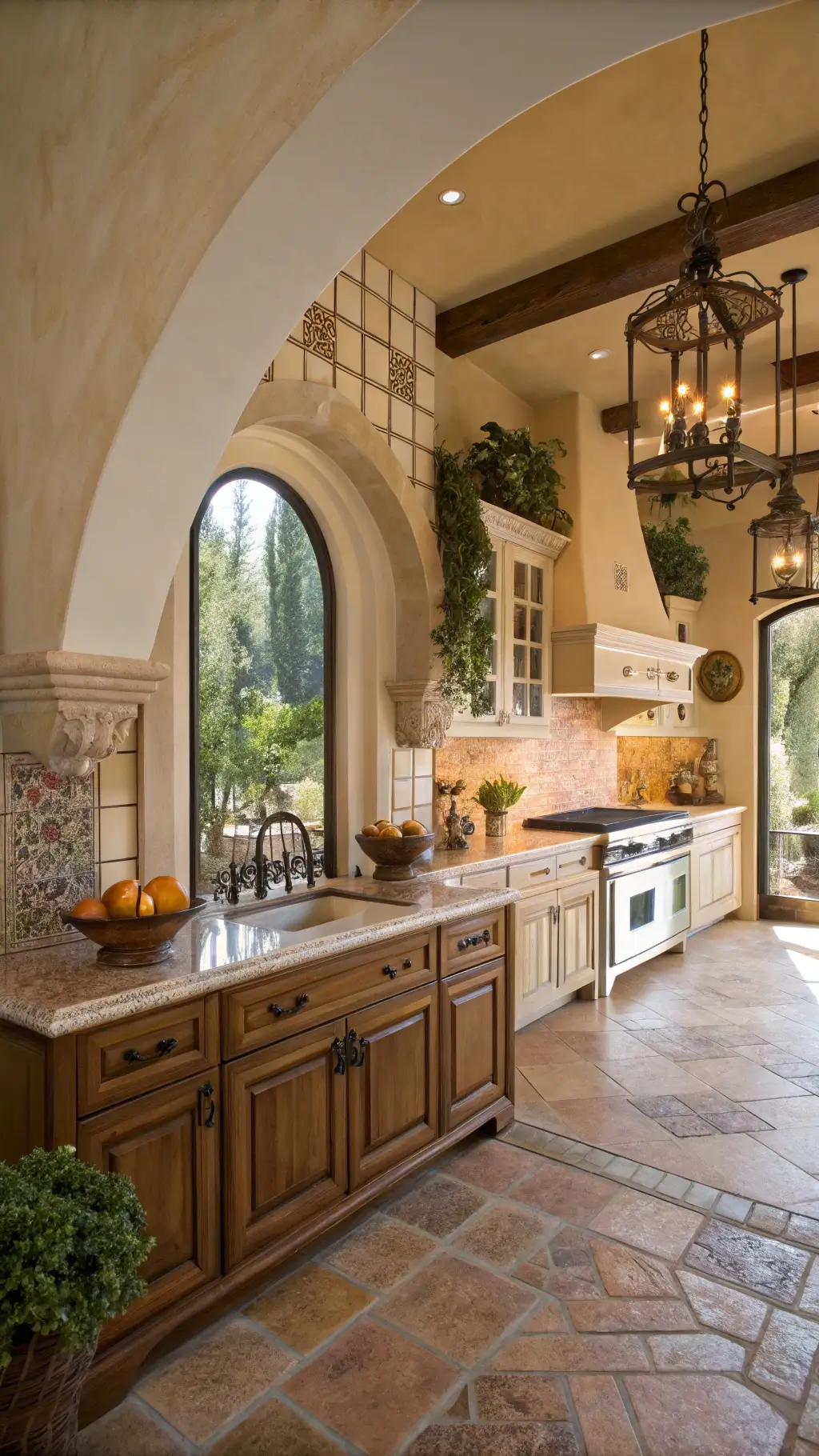
Common Mistakes to Avoid
Color Pitfalls:
– Matching everything too perfectly
– Ignoring undertones
– Forgetting about natural light
– Skipping sample testing
Your Action Plan
1. Grab paint swatches
2. Test colors in different lighting
3. Consider your home’s overall style
4. Don’t rush the decision
Pro Hack: Take photos of your potential color combinations in various lights. What looks perfect at noon might look completely different in evening light.
Investment Breakdown
Budget Range: $100-$500
– Paint: $50-$200
– Primer: $30-$100
– Hardware: $20-$100
– Miscellaneous supplies: $10-$50
Final Thoughts
Open one upper cabinet and one lower until the colors are talking to each other across the countertop. Kitchen color combinations succeed when the division is doing the framing. The best ones feel like spaces where the line is doing the biography.